A Running Year in the Books... literally.
So... if you've been reading my blog, you recall I started running earlier last year, and I mentioned my little scrappy journal that I was keeping for logging my runs and races and inspiration...
Well... I decided I wanted to do something more "finished" looking about halfway through the summer. A photo book! I had that huge pile of race bibs hanging on my bib board and no where to keep them after the year was over, so I designed a layout in Photoshop to include a photo of the race t-shirt, any photos of me from the event, the race name and logo, the date, my time and the race distance, all set opposite of a blank page to attach the bib to. I think it turned out great, and I absolutely love it! I've gotten so many compliments on it, I thought I'd share it with you all...
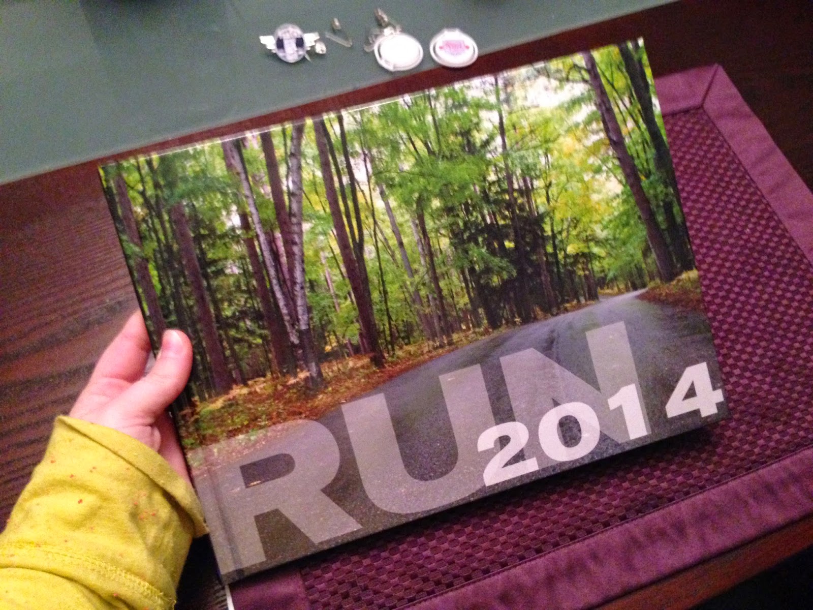
First, the front cover. I took this photo after a rainy 10K at Potawatomi State Park in Door County, WI called Run Wild. I loved this race a lot, despite the weather. Picturesque and full of wildlife, yet fully paved. I do love trail running too, but I liked not having to worry about tripping on roots while gawking at the changing leaves.
So let's break this down. I photographed each race tee against my neutral grey garage (go figure...), making sure that it was at a time of day where there weren't too many harsh shadows.
Obviously, the photos with less shadows were much easier to cut out in Photoshop and place on the weathered wood panel in my page layout. I then added a fake shadow back in to give them some dimension.
This is my page from a fun first annual race called the 5KGRB. GRB is the abbreviation for Green Bay's HUGE international airport (I joke... it's tiny). The race was actually run on the tarmac of the runway (meaning that the entire airport was shut down for the better half of the day). It was a mentally hard run because it was so flat and straight, and you could see everyone and the finish line the whole time. The event itself was pretty cool though- the race began with a helicopter flyover and ended by going through a "gauntlet" of various aircraft. They even had an after party with live music in a brand new airplane hangar...
Throughout most of my book, I decided to desaturate the images and give them a bit of a sepia tinge so the colors of the backgrounds really popped. For a few of them, however, I decided to leave some color in them.
I was really proud to have the prettiest cheer squad sign on the course for my first half marathon...
As for the fonts and stripes... I really like the look of different opacities of white overlayed on top of each other, so that's what I played with there. Occasionally, if I felt a race was particularly festive, I'd change the colors of the stripes to fit the theme of the race- like this page from the Turkey Trot on Thanksgiving:
The opposite bib pages were intentionally left very plain because I wanted the bibs to be the feature. I'm not sure why I gravitate towards keeping stuff like this, but I've always had sentimental attachments to random objects so it's not surprising. And I worked hard to accumulate this many!
The stripes continue from the left page all the way across the right. On a few occasions, I mixed it up and put a graphic image in the background, like this one for the Noodleini 15K (sponsored by Noodles & Co.).
Once I got all the pages designed, I uploaded them to Snapfish.com. Well, I guess I was so excited about this project that I would upload a new spread after every race, so my Snapfish account kept track of all my images for me. Then I realized that I had sized them all incorrectly. Ugh.
The website doesn't do a great job explaining exactly what size images need to be for a full-page spread. That's probably because they expect people to use their templates instead of designing their own, but I figured out that for the 8.5 x 11 book, you want your images to be 8.75 x 11.25 (1/8" bleed all around). When you place the images into the book creator thing, the red dotted line is where they claim the page will be trimmed; this is accurate for the outside edges, but the inner fold of the book won't be trimmed. You just want to be sure that all of your images and type are well inside that dotted red line. I wouldn't recommend using their online chat feature either... you will just be connected to someone overseas who will cut and paste answers to your questions and be generally unhelpful.
All in all, my book ended up being about 50 pages, which comes out to be pretty pricey. While it's definitely worth it to have such a nice preservation of memories, I kept getting a 50% off coupon code popping up so of course I snapped it up! My book ended up costing around $35 with shipping... not too shabby! I got it ordered and then played the waiting game... anxiously.
About a week later... it arrived! I was so excited, I couldn't even wait to finish my breakfast before ripping open the box to see how it turned out. I was a tad concerned about the cut lines (since I couldn't get a straight answer from the chat tool robots), but I was pleasantly surprised at how nicely everything turned out.
Now to finish it up and put in the bibs. I had to remove the foam sticky chip things from the backs of all the bibs so the book would stay closed, but I did it carefully to avoid ripping anything. I just used a sticky glue dot runner to tack down the corners of the bibs, and ta-da! A lovely, inspiring and empowering coffee table book for me to brag about... until next year's model!
Well... I decided I wanted to do something more "finished" looking about halfway through the summer. A photo book! I had that huge pile of race bibs hanging on my bib board and no where to keep them after the year was over, so I designed a layout in Photoshop to include a photo of the race t-shirt, any photos of me from the event, the race name and logo, the date, my time and the race distance, all set opposite of a blank page to attach the bib to. I think it turned out great, and I absolutely love it! I've gotten so many compliments on it, I thought I'd share it with you all...
The first page is a photo of me accepting an award from the director of the Bellin Run for the Titletown Wellness Series. This is a huge accomplishment for me... I set out at the start of the year hoping to place third in my age group. I completed all six races in the series and ended up getting first place! Well... technically second, but the first place girl in my age group actually took first in the whole thing, so it defaulted to me.
Then for the race pages... I did 24 races between April and December, but I'll only show you a few of my favorites. Hmm... which to pick first? Let's go with my 5K PR page. This race took place in Algoma, WI, and started and finished right along the lakeshore. I still can't believe how fast I was moving... I finished my first 5K in April in :36:00- that's an improvement of eight and a half minutes! Holy cow!
Obviously, the photos with less shadows were much easier to cut out in Photoshop and place on the weathered wood panel in my page layout. I then added a fake shadow back in to give them some dimension.
This is my page from a fun first annual race called the 5KGRB. GRB is the abbreviation for Green Bay's HUGE international airport (I joke... it's tiny). The race was actually run on the tarmac of the runway (meaning that the entire airport was shut down for the better half of the day). It was a mentally hard run because it was so flat and straight, and you could see everyone and the finish line the whole time. The event itself was pretty cool though- the race began with a helicopter flyover and ended by going through a "gauntlet" of various aircraft. They even had an after party with live music in a brand new airplane hangar...
I was really proud to have the prettiest cheer squad sign on the course for my first half marathon...
And the colors of the leaves for this wicked 5K that ended at the top of a sledding hill were so pretty, I had to leave them in all their glory.
As for the fonts and stripes... I really like the look of different opacities of white overlayed on top of each other, so that's what I played with there. Occasionally, if I felt a race was particularly festive, I'd change the colors of the stripes to fit the theme of the race- like this page from the Turkey Trot on Thanksgiving:
The opposite bib pages were intentionally left very plain because I wanted the bibs to be the feature. I'm not sure why I gravitate towards keeping stuff like this, but I've always had sentimental attachments to random objects so it's not surprising. And I worked hard to accumulate this many!
The stripes continue from the left page all the way across the right. On a few occasions, I mixed it up and put a graphic image in the background, like this one for the Noodleini 15K (sponsored by Noodles & Co.).
Once I got all the pages designed, I uploaded them to Snapfish.com. Well, I guess I was so excited about this project that I would upload a new spread after every race, so my Snapfish account kept track of all my images for me. Then I realized that I had sized them all incorrectly. Ugh.
The website doesn't do a great job explaining exactly what size images need to be for a full-page spread. That's probably because they expect people to use their templates instead of designing their own, but I figured out that for the 8.5 x 11 book, you want your images to be 8.75 x 11.25 (1/8" bleed all around). When you place the images into the book creator thing, the red dotted line is where they claim the page will be trimmed; this is accurate for the outside edges, but the inner fold of the book won't be trimmed. You just want to be sure that all of your images and type are well inside that dotted red line. I wouldn't recommend using their online chat feature either... you will just be connected to someone overseas who will cut and paste answers to your questions and be generally unhelpful.
All in all, my book ended up being about 50 pages, which comes out to be pretty pricey. While it's definitely worth it to have such a nice preservation of memories, I kept getting a 50% off coupon code popping up so of course I snapped it up! My book ended up costing around $35 with shipping... not too shabby! I got it ordered and then played the waiting game... anxiously.
About a week later... it arrived! I was so excited, I couldn't even wait to finish my breakfast before ripping open the box to see how it turned out. I was a tad concerned about the cut lines (since I couldn't get a straight answer from the chat tool robots), but I was pleasantly surprised at how nicely everything turned out.
Now to finish it up and put in the bibs. I had to remove the foam sticky chip things from the backs of all the bibs so the book would stay closed, but I did it carefully to avoid ripping anything. I just used a sticky glue dot runner to tack down the corners of the bibs, and ta-da! A lovely, inspiring and empowering coffee table book for me to brag about... until next year's model!


Comments
Post a Comment