Puppy Portraits
My good friend who owns the wedding/event venue recently opened a second location, and she's doing something really cool with it. She has a small staff helping her out with everyday business, and she's encouraging them all to host events as fundraisers for organizations or causes they're passionate about for no cost, which is super generous and awesome!
This concept is a win-win all around. It helps the venue get their name out, plus they have a liquor license and a full bar for beverage sales. It helps the charity or cause with awareness and monetary support. And best of all, it gives people in a small town some fun things to do for a night out!
I don't work for Gina (although I helped translate her vision for the new venue space!), but she asked me if I'd be interested in teaching "Paint Your Pet" nights to raise money for the Humane Society. Of course I said I would be honored- but I hadn't painted in years! I would need to get some practice and make sure I could actually paint a pet before I committed 100%.

I decided to start with a portrait of my mom's dog, Schnoodles. If it flopped, oh well. If it turned out, awesome! Instant Christmas gift (a twofer!). I went through my phone and found a picture that would work- he recently got a haircut and isn't as cute and fluffy, so I went back to earlier this year when he was staying with us for a few months. He was kind of soggy in the best picture I had (I think it was snowing?), but that's ok. It actually kind of helps define his curly hair a little bit.
I started by printing the picture large enough to see the detail, but not so large that it would be cumbersome or wasteful. I started with a rectangle print, but decided to cut it into a 6" square after I purchased my 12" square canvases (7 for $17 on Amazon.com!). These sizes actually ended up working really well to divide my picture and canvas up into a grid for sketching; 1/2" grid on the picture (in pen), 1" grid on the canvas (lightly in pencil).

Making the grid isn't super necessary- especially this close together- but it really helps with placement of features and details and helps get the proportions right. You've seen portraits of people that just don't seem to look like who they're supposed to, right? It's crazy how much the slightest change in proportion can completely change a painting!


This concept is a win-win all around. It helps the venue get their name out, plus they have a liquor license and a full bar for beverage sales. It helps the charity or cause with awareness and monetary support. And best of all, it gives people in a small town some fun things to do for a night out!
I don't work for Gina (although I helped translate her vision for the new venue space!), but she asked me if I'd be interested in teaching "Paint Your Pet" nights to raise money for the Humane Society. Of course I said I would be honored- but I hadn't painted in years! I would need to get some practice and make sure I could actually paint a pet before I committed 100%.

I decided to start with a portrait of my mom's dog, Schnoodles. If it flopped, oh well. If it turned out, awesome! Instant Christmas gift (a twofer!). I went through my phone and found a picture that would work- he recently got a haircut and isn't as cute and fluffy, so I went back to earlier this year when he was staying with us for a few months. He was kind of soggy in the best picture I had (I think it was snowing?), but that's ok. It actually kind of helps define his curly hair a little bit.
 |
| Soggy Schnoodles |
I started by printing the picture large enough to see the detail, but not so large that it would be cumbersome or wasteful. I started with a rectangle print, but decided to cut it into a 6" square after I purchased my 12" square canvases (7 for $17 on Amazon.com!). These sizes actually ended up working really well to divide my picture and canvas up into a grid for sketching; 1/2" grid on the picture (in pen), 1" grid on the canvas (lightly in pencil).

 |
| Acrylic rulers... not just for quilting! |
Making the grid isn't super necessary- especially this close together- but it really helps with placement of features and details and helps get the proportions right. You've seen portraits of people that just don't seem to look like who they're supposed to, right? It's crazy how much the slightest change in proportion can completely change a painting!
I then sketched Schnoodle, starting with his nose. Not sure why I started there- it just seemed to be a good place to start. If you look carefully, you can see that I started sketching one block to the right of where I was supposed to, making the portrait a tad more off-center than intended. I actually really like it- symmetry is overrated. :)

Then came paint! I debated between teal and salmon for the background, since those are my mom's favorite colors. I decided on teal since she's got a teal rug and chair in her living room... plus, I already had the paint. Ha ha.


I don't have any pictures of my painting process- I'll try to get some on the next one. Here's a basic breakdown of my process:
- Using a large brush, fill in the background, adding a nice gradient to give depth and some highlights for texture.
- Keep the same brush, and fill in the darkest areas first, working across the whole painting for consistency.
- Build up layers, working towards the lighter values. Don't think too much about detail yet. I used the same large brush for 98% of this painting. You can get a lot of texture by just holding the brush at different angles!
- When I filled in Schnoodle's little body, I mixed in some of the teal from the background to help it blend in and keep the focus on his face.
- Finally, I went back in with a very fine brush to add the wispy curly hairs on his ears and face. Don't worry about being exact. It's a painting- it's not supposed to look like a photo!

I just used a random hodge-podge of acrylic paints from my stash, so none of them were really the same brand. Some were thicker or thinner and thus coated differently, and the black seems much shinier than the rest. It actually works though, since the eyes and nose are supposed to be shiny! All together I only used five paint colors in this painting- teal, aqua, creamish white, grey and black! The values are all just created from blending those together. It also helps that he's grey...
 |
| The Schnood! I feel like he needs some more dark values on the left side... |
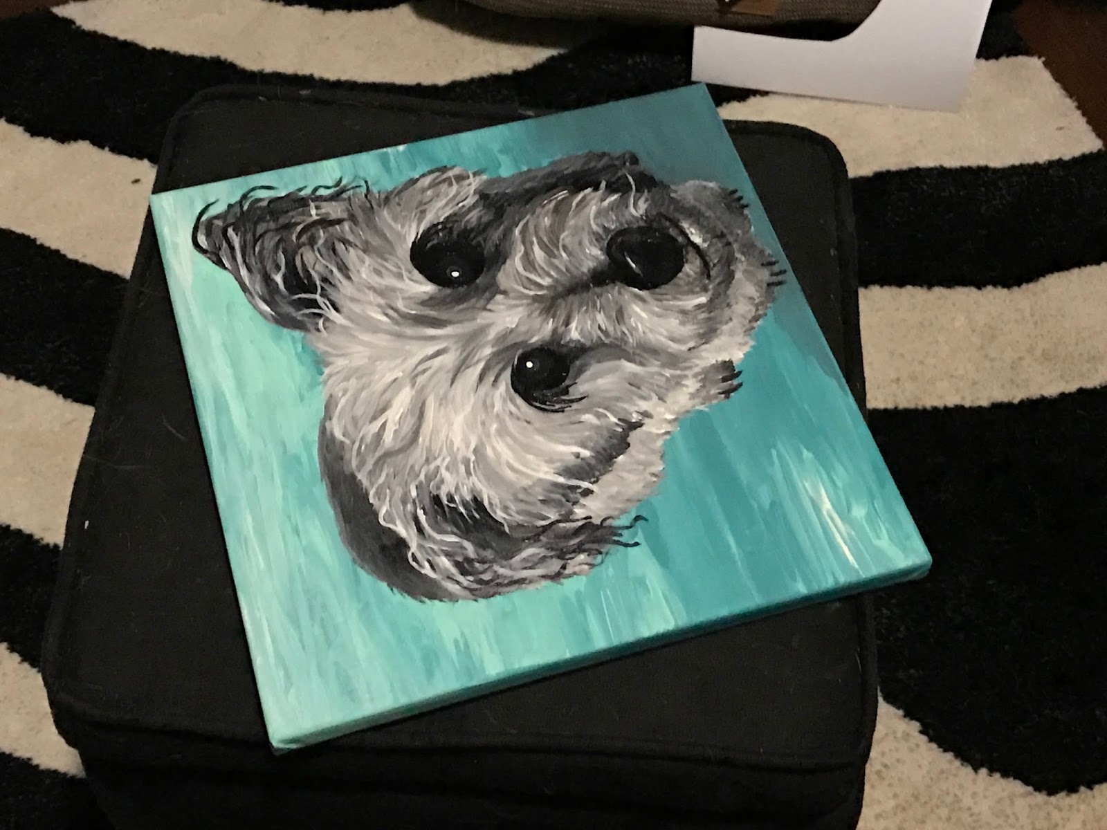 |
| It looks oddly different sideways! Perspective! |

Comments
Post a Comment